Creating, Texturing and Rendering a Wine Bottle & Box: Using a Logo for a Roughness Map
Share this video
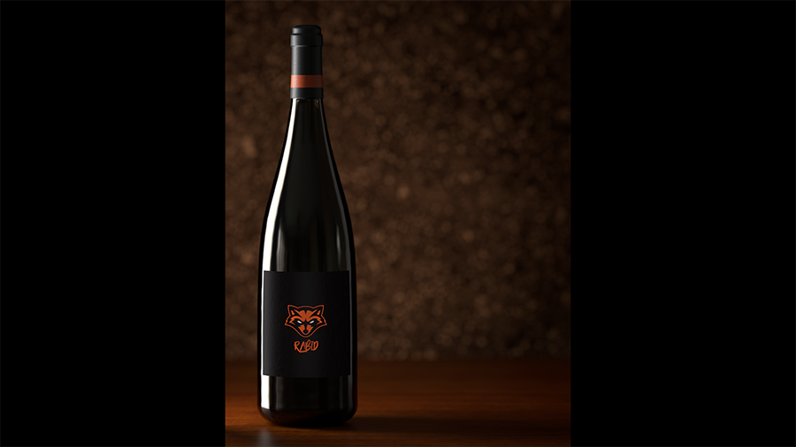
We’ll use the raccoon logo in the cardboard insert material’s reflection roughness texture slot to mix shiny reflections with dull reflections. This will reveal the brand using an interesting mix of reflections over the same orange color. Then we’ll add texture detail to the wood using a few grayscale variations of the wood texture in the reflection strength and bump slots. This installment of the series will then end in this video when we open the render settings and enable our high quality 2 page preset for the final render.
Transcript
In this video, we'll finish up our packaged design and get it ready for the
final render. We'll be adding texture detail to the cardboard insert and the
wood floor, and then we'll set the focus distance on the two-page camera for depth
of field. Finally, we'll be ready to sit back and watch all of our work pay
off in the final render. Here's where we left off in the
last video, and we're going to finish up in this video by texturing the cardboard
insert that the wine bottle's sitting in, and we're going to add some texture detail
to the wood floor. Right now, it kind of looks like a wood laminate,
and we're going to make that look more like natural wood. So here is the final,
and you can see I've used the racoon face as a reference map to mix shiny and rough
reflections on the insert. And then, the wood, I've broken up the reflections
and added a little bit of bump, so you can see the grain indenting
into the wood. Let's start out with the cardboard insert, and I'm going to set
up an interactive render region boundary right here in my Viewport,
that encompasses the box. And now that that is defined, I'm going
to turn that off. I'm going to come into my Render Settings,
and in my Output tab, I'm going to enable render region,
and then go ahead and just copy that from the IRR region. And now whenever
we render, we won't have to wait for that whole frame, and we can compare our
renders as we go. I'm going to use a copy of the box stripe material.
So, I'm going to Ctrl drag that. And then in the Basic tab,
I'm going to rename that, cardboard insert. Then let's clear
out that alpha channel, because we don't need that anymore.
Now I'm going to turn that off in the basic. And then over in the reflectance,
I also do not need the logo anymore. But I do want that orange color,
so I'm going to activate the layer color, and then use the eye dropper
to sample that orange. And now let's clear that texture out.
Now, this material has the orange color, and we have that reflection layer that's
going to match the stripe. And we can use that on our cardboard
insert now. So, let's copy that onto the cardboard insert. Take a look at how
that renders. And you can see the reflection of our light panel is very
rough on this material. So, let's go ahead and use a texture map
to mix that with the shiny reflection. And we're going to do the same thing we
did on the ribbing of the outside of the box, and that is, jump into the default
diffuse layer, activate the texture, and let's put the raccoon face texture
in there. I'm going to jump into garage shading, and you can see there's the
raccoon face. Let's check our projection, and it's set to UVW.
So, I want to change that to flat, jump out to our working view,
activate texture and access, just like we did with the box,
and then rotate that down 90 degrees, and scale it down to a reasonable size.
You can see we're starting to get tiling, which I don't want.
So, I'm going to scale that up enough to get rid of the tiling,
and kind of frame up our bottle in a nice way. So, you can see a little bit of the
eyes here, and I like how the top of the head framed up the neck of the
wine bottle. So, that's good. Let's turn off our texture and access
tools. Jump back into the material, and let's copy the texture and then clear
it out. And then, we can jump right into the reflection layer,
and in the roughness texture, let's paste our texture right in there.
Jump back out to our render view, and you can already see a little bit
of the face in the reflection. I'm going to crank up the roughness just a
little bit more, give us a little bit more definition, and I'm also going to turn the
layer color on our reflection layer up to a full white, and that'll make this
a little bit more apparent as well. And to make it even more noticeable,
I'm going to grab our overhead light plane. I'm going to widen it and move
it over, and now we can really see it showing up. So, let's take a look at that
in our render view. This is a good start, but I actually would like the parts
of the insert, where the paper would be on the label here, to be the blurry part.
And then, the areas where the ink is on the label, I would like that to be the
shiny part. So, to accomplish that, we need to invert this texture,
which I'll show you how to do. And the second thing I noticed is it's,
like, perfectly mirrored our shiny part of the reflection, and I don't want it to be
0% rough. I would like to add just a little bit of roughness into that area
as well. So, there's still a contrasting reflection, but it's not 0 to 37 or
whatever value we're using. And the last characteristic is I'd like to add
some bump. So, you see in our reference how there's a little bit of roughness in
the shiny part of the texture. So, we're going to add in a bump as well.
We can do all of that in the Reflectance Channel, right here on our
cardboard material. Let's go ahead and invert the texture, and to do that,
I'm going to place it in a layered texture, which is right here,
if you hit that fly out. Now, we're inside a layered texture,
so we just click once to get in it. You can see our view port just caught up.
Now, we can select this bitmap. Right click it, since we're in a layered
texture, and invert that image. And now, our blacks and whites have
been reversed, and now our viewport has just caught up. So, you can see the blurry
parts match the paper parts, and the shiny parts match the ink,
which is the look that I wanted. I'm going to go ahead and move the light
plane up just a little bit, so now that line is clearly visible in a
shiny part. And now, to get a little bit of roughness in these
black areas, we just need to make this black, not pure black.
We need to lighten it just a little bit, and that's going to let a little bit
of this 37% roughness show through. So, an easy way to do that is hit Shader,
and put in a color, and that gives us a white, by default, solid color.
I'm just going to drop that to the bottom of the stack, and now we can just drop the
opacity of our top layer. And then, the black mixes with the lower white and
becomes a gray. And now you can see, our viewport's caught up and we have a
little bit of roughness. Let's try at 90, and you can see the difference.
So, let's take a look at that in the render view, see how it looks.
And that looks pretty good. I'm happy with that.
This sharp line here is actually a reflection of the box side.
But if you look at this line here, it's been roughened up just a little bit,
because we turned those blacks to a gray. And the last item to address is bump
in the shiny parts. So, we can do that in the Reflectance Channel
as well. So, I'm just going to go straight back up, and right down here on our
reflection layer, is the bump strength. And we need to change that to custom
bump map. The first slot is for a mask, and then the second slot after you change
that mode is for our actual bump texture. So, I'm going to use a noise in this
slot right here, and you can already see it. In the Viewport, it's kind of
messing it up. Let's take a look in the render, just so we can see. The pattern's
way too big, and the intensity is way too high. But you can see,
it is indeed roughing up the surface. So, let's jump into the noise,
and I'm going to drop the pattern way down to, like, 20%. And you can see,
it's much smaller of a pattern now, and I'd like it to be a little
less intense. So first, I'm going to drop the contrast of our
noise pattern. So now it's a mixture of grays, and you can see it's definitely
less intense. There's less difference between the upper and lower regions.
And then, we can further decrease the strength and intensity with this strength
slider right here, underneath the texture. And I believe I need to come all the
way down, like, two. So, let's take a look at that.
And I'm pretty happy with that. It's a little bit more intense than I'd
like, so I think I'll drop it down to one to make it very subtle.
And I think that'll work. Now, let's go ahead and start on the
wood texture. I'm going to redefine my render region. Jump back into the Render
Settings and Output, copy that again from the IRR.
And let's go ahead and incrementally save our file, just so we can go back if we
need to. Let's take a look at where the wood's at right now.
And let's take one more look at our reference. You can see how shiny the
reflections are on this wood . And this is pretty dull and rough.
Let's go ahead and fix that. I'm going to move our Attribute Manager down.
If you'll remember, we dialed in these settings for the one page layout,
and I don't really want to lose those. So, I'm going to Ctrl+drag a copy of our
floor, and change the name to Two Page. And then, let's replace the floor two-page
texture tag with this new material. We move the Attribute Manager back up
and jump right over to the Reflectance Channel. And to brighten that reflection,
I'm going to go into the reflection layer and crank up that layer color
to pure white, and drop the roughness down to about 13%. Let's take a look at that.
That looks pretty good. Now, let's add that roughness in the reflection
in the bumps, and in the interest of saving time, I've pre-made these textures.
So in reflection strength, let's add this wood reflection that I've
made. I'm going to jump in and show you this. It's just a grayscale version
of the wood texture that I've applied some levels on in Photoshop.
So, lower value of whites, higher value of blacks,
so it's just not so intense. Let's take a look at that.
And you can see the reflection is not as strong in the darker areas of that map.
And we could have done with this with a filter effect right here in Cinema,
but just trying to save a little bit of time, since we're running long
on these tutorials, and let's go ahead and add the bump as well.
I'm going to change that to custom bump map, activate the texture,
and this is the exact same thing, just different levels in Photoshop,
of a black and white texture. And you can see the bump is already way
too strong. So, I'm just going to turn that down to around five,
and I'll show you this image, just so you can see it. Same image,
just brighter whites, darker blacks. Let's take a look at that.
And the wood looks pretty good. I am noticing that my reflection stops,
kind of before it gets to the other box. So, I'm going to go ahead and adjust that
just by widening out my reflection plane, or my light plane, and then scooting it
over. So, we're still getting that effect on the box insert, but it's also going
to stretch across to hit the other box. Yeah, that's much better.
Getting a nice hit on the top of that box that we spent all that time on,
and our effect over here looks the same. We're just about there.
I'm going to go ahead and turn off render region, render a full frame.
And that was Ctrl+B to bring up my render settings to turn that off.
And I just have one more tweak I want to do to the wood, and that's to tighten the
grain up a little bit. This wood looks so big, the grain does,
that it's kind of making my bottle look like a miniature. And I've also noticed,
this area right here is actually my bad Photoshop work. I manually tiled
this texture, and that's just a little bit of bad stamping. To fix that,
I'm going to scroll down to my floor, grab the texture tag,
and drop the V length to around 75%, is the number I came up with,
and that pushed my bad stamping right to about here. So, I'm going to offset the V
and just push that out of frame. Let's take a look at that.
And that looks pretty good to me. That's all for the wood texture.
The last step that I wanted to do is, you see our focal plane,
I'm going to move my Attribute Manager back down. On our two-page camera is way,
way down there in the scene. And I want the in-focused area to be right
here on the label. So, if we just come to the two-page camera
Object tab...remember there's this focus distance picker, and we can just click
on the label, and you see now that will be the center of focus.
And there will be hardly any depth of field that we'll see.
But even if we get a little bit, it'll add just a little bit of realism
to the render. So, I'm going to leave it on. Just wanted to make sure to set
that distance, otherwise, the whole frame would have been blurry
when we come into our render settings with Ctrl+V and switch to the two-page final.
And our two-page final, remember, has a very large res.
And for the interest of this recording, at 1920 by 1080, I'm going to go ahead and
drop my final res to the lower res that we've been doing for the work
in progress, just so it'll fit on the screen. I'm going to save my file,
and that's all. So, I'm going to go ahead and hit render, and we'll take a look
at our final image. And that's it for our wine bottle packaging.
I stepped through all of this material tweaks fairly quickly,
but this took me a lot of trial and error, and sitting around waiting for renders
to finish. So, don't get discouraged if your personal projects take much longer.
We'll finish off this project in the third installment of the series
by learning how to use render takes. There, we'll find out how to make all
of these layers, render settings, and cameras
work together with a single switch.